
A login page in default blue can look out of place next to your store’s own brand colours. Customers notice. A button that doesn’t match your logo, or a promo panel that clashes with your header, makes the page feel unfinished. Custom Login for WooCommerce lets you set the main login page colours from one screen, with no code.
This article shows you how to set the panel, text, button, link, input, and promo button colours. You’ll also choose how the promo panel behaves on phones. Choosing a template, renaming form labels, and editing promo text each have their own articles.
Prerequisites
| Requirement | Details |
|---|---|
| Plugin | Custom Login for WooCommerce installed and active |
| WooCommerce | Installed and active |
| Access | An account that can manage WooCommerce settings |
| Colour values | Your brand colours as hex codes, such as #1e40af |
Step 1: Open the Design tab
- Go to WooCommerce → Custom Login in your WordPress admin.
- Click the Design tab.
The colour settings sit in their own sections: Panel Colors, Button Colors, Promo Button Colors, Link Colors, and Input Colors. Mobile Promo Display sits below them.
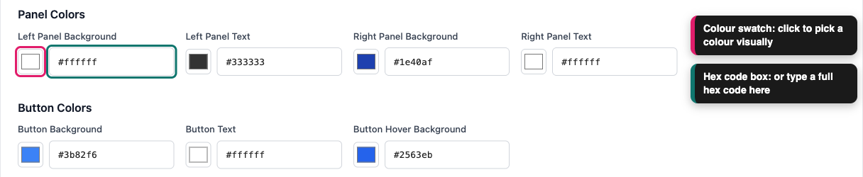
Each colour has a colour swatch and a small text box. Click the swatch to pick a colour visually. Or type a hex code straight into the text box.
Step 2: Set the panel colours
The Panel Colors section sets the background and text colours for the two sides of a split login page. The left side holds your login form. The right side holds your promo message.
| Setting | What it changes | Default |
|---|---|---|
| Left Panel Background | Background behind the login form | #ffffff |
| Left Panel Text | Text colour on the form side | #333333 |
| Right Panel Background | Background behind the promo message | #1e40af |
| Right Panel Text | Text colour on the promo side | #ffffff |
Pick a background and a text colour with strong contrast. For example, light text on a dark background stays easy to read, while grey text on a pale grey background doesn’t.
Step 3: Set the button colours
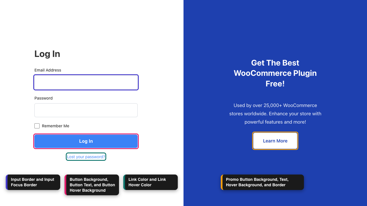
The Button Colors section styles your login button. Hover means the moment a customer moves their mouse over the button. A different hover colour tells them the button is ready to click.
| Setting | What it changes | Default |
|---|---|---|
| Button Background | Colour of the login button | #3b82f6 |
| Button Text | Colour of the words on the button | #ffffff |
| Button Hover Background | Button colour while the mouse is over it | #2563eb |
A hover colour that is slightly darker than the main colour works well.
Step 4: Set the promo button colours
The Promo Button Colors section styles the button inside your promo panel, such as Learn More. These colours only matter when the promo panel is visible. If you switched off Enable promo section on the Content tab, you can skip this step.
| Setting | What it changes | Default |
|---|---|---|
| Promo Button Background | Colour of the promo button | #ffffff |
| Promo Button Text | Colour of the words on the button | #1e40af |
| Promo Button Hover Background | Button colour while the mouse is over it | #f3f4f6 |
| Promo Button Border | Outline around the button | #ffffff |
Make sure the button stands out against the Right Panel Background. If both are the same colour, the button blends into the panel.
Step 5: Set the link colours
The Link Colors section styles the Lost your password? link under the login form.
| Setting | What it changes | Default |
|---|---|---|
| Link Color | Colour of the link | #3b82f6 |
| Link Hover Color | Link colour while the mouse is over it | #1d4ed8 |
Step 6: Set the input colours
The Input Colors section styles the Email Address and Password boxes.
| Setting | What it changes | Default |
|---|---|---|
| Input Border | Outline around each box | #d1d5db |
| Input Focus Border | Outline while a customer is typing in the box | #3b82f6 |
Focus means the box a customer has clicked into. A bolder focus colour shows them where they are on the form.
Step 7: Choose how the promo shows on mobile
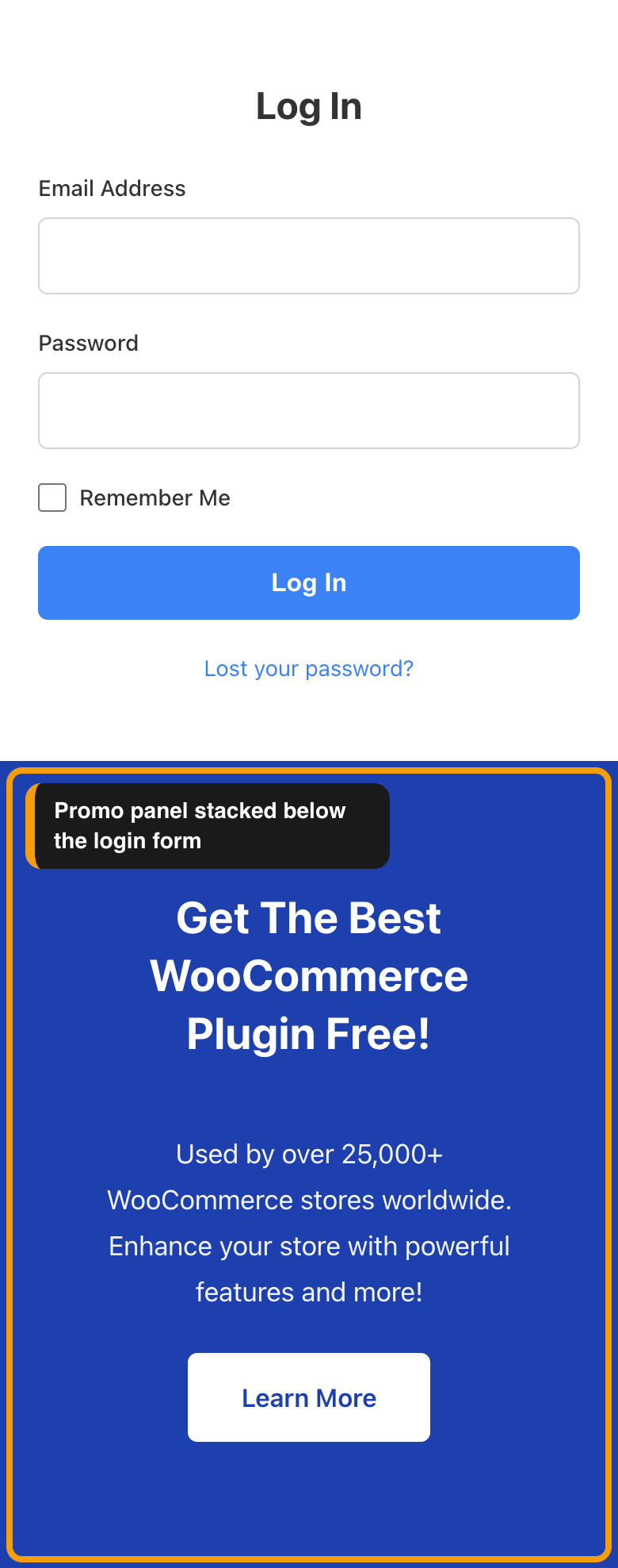
On a wide screen, the promo panel sits beside the login form. On a phone there isn’t room for both. The Mobile Promo Display section lets you decide what happens instead.
| Option | What happens on a phone |
|---|---|
| Hide on mobile | Only the login form shows. This is the default. |
| Stack below login form | The promo panel shows underneath the login form. |
These options apply to screens about 768 pixels wide or narrower. On Gradient Modern and Warm Organic, the switch happens at 900 pixels. Stack below login form only has an effect when Enable promo section is on.
Choose Hide on mobile for the fastest, cleanest login. Choose Stack below login form when your promo carries an offer you want phone shoppers to see.

Step 8: Save and check your login page
- Click Save Settings.
- Log out, or open a private browser window.
- Visit
yourstore.com/loginto see the new colours. - Hover over the login button to check its hover colour.
- Hover over the Lost your password? link to check its hover colour.
- Open the page on your phone to check the mobile layout.
Which colours each template uses
Every template reads your colour settings, but some templates also set a few colours of their own. Those template colours win over the matching setting. Classic Split follows all of your colours. The other templates keep part of their built-in look, so some settings have no visible effect there.
| Setting | Classic Split | Centered Card | Gradient Modern | Dark Mode | Warm Organic |
|---|---|---|---|---|---|
| Panel backgrounds | Yes | No | No | No | No |
| Panel text | Yes | Yes | Partly | No | No |
| Button Background and Button Hover Background | Yes | Yes | No | No | No |
| Button Text | Yes | Yes | Yes | No | No |
| Link colours | Yes | Yes | Yes | No | No |
| Input Border | Yes | No | No | No | No |
| Input Focus Border | Yes | Yes | No | No | No |
| Promo button colours | Yes | Phones only, when stacked | Yes | Yes | Yes |
“Partly” means the form labels use your text colour, but the template sets its own heading and promo text colours. Centered Card hides the promo panel on wide screens, so the promo settings have nothing to colour there.
On every template, Button Background also colours the Remember Me checkbox when it is ticked.
If you want full control of every colour, choose Classic Split. For detailed instructions, see how to choose a login page template.
Troubleshooting
#, and click Save Settings. The plugin only accepts hex codes such as #1e40af. Anything else, including a colour name like blue or a code missing the #, is dropped and the default colour shows instead.Frequently asked questions
Need help?
Custom Login for WooCommerce is a premium plugin, so if you run into trouble, open a support ticket and our team can help you get set up.